Wednesday 30 December 2015

Hurry up, it's Hogmanay!

I've been so enthralled with building my holiday village over the last few weeks that I never got around to making my December tag for The 12 tags of 2015, and tomorrow it would be too late because it's Hogmanay today. I live in Scotland and Hogmanay (the last night of the old year) is traditionally a bigger event than Christmas in this part of the world. But my friend Cheryl sent me a message yesterday demanding to know where December's tag was. So here it is...


The burlap panel is Tim's and is inked with DecoArt Media shimmer mister in turquoise, using Tim's Christmas stencil.  I wanted a blue theme to go with my vintage baubles.
Cheryl sent me some die cuts recently, including this Merry Christmas, so that was perfect for this tag. I coloured the white card with peacock feathers distress ink and used vintage platinum glitter dust to add sparkle to the snowflake. I raised this up on sticky dots to give dimension.  


I didn't have the dies that Tim used to create his wreath but found a length of wired holly and used that instead. The pale aqua rayon ribbon I didn't grunge up this time, just made a triple wrap bow so it was fluffier, and the tiny baubles are vintage ones I had in my stash.


And, guess what. I finished ALL the tags for the year, so that's the one and only new year resolution that I managed to keep!  Here's a picture of my tag board. 


October tag is in the White frame to the right, displayed with all my Tim goodies that I was lucky enough to get from Tim because he liked my witchy tag so much. Still can't get over that!
.
Can't wait for the 2016 tag challenge, but that will only be until tomorrow. Happy New Year!

Wednesday 23 December 2015

Last one, again

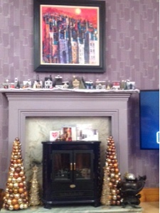
Okay, positively the last one, for now.  I've no more room on my mantelpiece.


This is the one I made today...


This one is a Tudor thatched cottage, and I've altered the die cut to add another window. This was achieved by cutting out two sets of the dwelling and then snipping off the window on the right and left side of each of the second set, including the tab, and glueing those to the tabs on th first set, so adding an extension. I also had to add an extra strip to the roof piece - though take care which side you add the piece to as I put it on the wrong side to start with and so the dormer didn't sit in the right place.  I'm sure you'll not be as stupid as me though.  

The beauty of 'black and white' houses is that they tend to be a bit on the squint, so any mistakes can be put down as historical accuracy.  For instance, I made my back extension a little too wide and now the back of the cottage is slightly curved. ;-) but that's fine by me. But my one big piece of advice when doing a black and white house is to draw all the lines before sticking the walls together. It makes decorating so much easier.

I had such fun drawing the lines. Google 'black and white Tudor house' and you get some amazing images to work from.  And if your hand is a little wobbly then that adds authenticity too. These houses are NEVER made in straight lines!

The windows in made slightly differently this time. I used some frosted paper one of last year's Xmas cards. This paper had some images on it so I cut away the mostly blank bits, and used those. I kept a couple of pieces with images and coloured them in using alcohol ink pens so you can see a Xmas tree, parcel and a star through the front windows. I had decided not to do diamond panes of glass, but it didn't look right once I the Windows were stuck on. I drew panes with a graphite pencil and actually like this technique better than using the ink pen like I did on the pub. Can get window panes much more to scale.
 
I cut out another door using a bit of card with spare window from the cannibalised set. I made this a rectangular door as the curved one just isn't right for a Tudor house, I painted it black and covered it in glossy accents so it looks painted.  The wreath decoration is a snip from a jewelled ribbon that I coloured with alcohol ink.

The thatched roof is felt sprayed th adirondack espresso ink, and the dormer has been shortened so it doesn't stick out over the roofline by much. I had to hand cut the snow felt as the roof is a little longer due to the extension. I made the chimney in red 'Tudor bricks' (barn door and fired brick distress pens).  

These little house look amazing when lit with a battery operated candle. I can't wait for Xmas day when I can switch them all on.


Merry Christmas everyone.

Saturday 12 December 2015

Last one. Maybe

Okay, so my mantelpiece is just about full now, so I think this will have to be the last of the dwelling for now.  I should have been doing some Christmas shopping today, but got sidetracked into doing this little building.


Every village should have a fire station, just in case the Christmas turkey roasting gets out of hand. This one has a very old appliance that needs replacing but the brigade have been spending money on more managers and giving themselves higher salaries, whilst at the same time reducing the number of actual firefighters so they didn't have budget to replace it with a new engine.  Maybe next year.  

Every station has a tower. Mine is modelled on the one I see out of my office window, every working day as I work for the Fire Service. The first time the firefighters dropped their realistic training dummy over the parapet I nearly died of shock. Used to it now, but still a little unsettling when you catch it falling from the corner of your eye.


That silvery thing in the left corner (from prima marketing) is the extractor that takes exhaust fumes from the engine bay to the outside world.  You probably knew that already.

Christmas Shopping

My mantelpiece is filling up fast, but you can't have a village without a shop-come-postoffice, so that's what I've made this time. And another two storey dwelling, so the shopkeeper can live over the shop. I treated the top storey like I did the previous ones, covered the door area and made a window, but this window is the one I cut away from the lower storey, where the door now is ( more later...)

This one has a thatched roof, which is just white felt sprayed with Adirondack Espresso spray ink. I cut it slightly bigger all round than the roof pieces, then stuck the felt down and folded over the excess and stuck  that with ds tape. That gives the rounded profile you get on thatch, not a sharp edge.  Warning! If you try this yourself don't be fooled into thinking your felt is dry. I left mine for an hour, and gently waved a heat gun at it, but as I was sticking it down I found it was still pretty wet. Going to have brown fingers for a day or two!

I wanted to make a large bay window for this shop, so I made a little box sized to cover over both the window and the pre cut door. The window is acetate, and at the back is a snippet of Tim's seasonal stash papers which I stuck on after I had 'dressed' the window. There's a little shelf (folded card) for a tree to sit on, and the tinsel is also Tim's. I heated that with a heat gun to curl it up a bit as it was a bit too spiky.  The billboard above the window is also from the seasonal stash, as is the poster in the side of the building.


I needed to cut away the left hand window to make a door (and used this spare window on the top storey), and the door is also acetate with a little silver pen added. It's a bit modern for the building, and I'm now making up stories about the shop keeper having heated discussions with the town council planning department about it.  Sorry, it was 2.30am when I finished this house, after a bad day atvwork, and I think I was overtired.  Maybe I will make another door, but it depends on what the planning officer decides.

So here's pictures of the finished shop.  Must get on with Christmas shopping...


Thursday 10 December 2015

Every Good Village Needs a Pub.

The house building obsession continues...

Yesterday I made a modern 2 storey house for my village, and decided that a flat metal roof would suit it. This was achieved by cutting off the gables from the top storey. I ended up with half a window at each side of the building but, well, why not?  I made the a roof using card slightly wider and about half an inch deeper than the building, covering it with metal tape and then running it through my Bigshot using Tim's Rivited Metal embossing folder. I grunged it up by swiping it with white paint (picket fence), and rubbing most of that off to give a zinc look, not too shiny.  Then I rubbed a little black paint into the rivets to age it a bit.   I curled then front and back edges over so it looked a bit quirky and modern.

To match the metal roof, I outlined the windows in a silver pen and made a metal door.


My village is coming along nicely, but every good village needs a decent pub, and preferably one with a bit of history, oak beams and a roaring log fire to welcome you in on a snowy day.  So I made one...


I started by making up the walls of 2 dwellings and sticking them together. As I didn't need 2 doors,  I removed the one on the right, then I cut a strip of card and punched another window in it using the movers and shapers small window die (forgot what it is called, sorry) and stuck this where the door had been. I outlined all the windows with black pen.

I then made up a third building, painted it black and used a pen to mark 'weatherboard cladding' on it.
I removed the door and made a window embrasure (3 layers of card) to cover up the hole, and gave all the windows the leaded pane treatment 

This became the upper storey for one side of the pub but I left the other side as a single storey.  The roof of the single storey building had to have small sliver cut from the left hand edge because there would be no overhang at this side. And you will see that the roofline has a definite lean, but it's a very old building (built 1588 according to the sign) so that's okay. :-)

My pub needed a name, and because it looked kind of like a smugglers den by the sea, I called it 
The 3 Ships (and it is for Christmas) painted a little sign for the front of the building, and gave it a big, studded Andy old black oak door.

Oh look, it's opening time. Mine's a G&T, thanks.


Tuesday 8 December 2015

A New Housing Scheme IMBY. Or on my mantelpiece.

I'd fallen in lust with Tim's Village Dwelling die and so I bought some of the die cuts (along with village winter and bell tower kits) from eBay thinking that I'd get over it after I'd made a few.

Nope. Made me worse.

These are ones I made using the eBay die cuts.


The die cuts were originally white card, so I painted them with Ranger Adirondack acrylic paints dabbers in Eggplant and Stream. Very Scandi, love these colours and they look fab with my wallpaper!

I'm now totally obsessed with making these little houses, and after making them and still lusting for more I went and bought the die. These are like gold dust, mas soon as they go in stock with retailers they sell out within hours, but I was lucky and got one. I think the fact I was online at 6.45am was a clincher, as they had all gone a few hours later.

So, first up when I got the die yesterday I made a little cabin, like Tim's.

Tim's video is here

I can't wait for the new accessory dies that Tim says will come out next year. YAY!k

I shamelessly copied this cabin as soon as I got my die, and used the same corrugated surface and techniques. The only difference is I used a wee vintage plastic deer instead of a tree as decoration.
That was last night.


My brain did not switch off even though I had put the glue gun away and was away to bed. In the middle of the night I woke up with an idea of trying to make a 2 storey Tudor black and white house. I just hate that I've got to go to work for a living, and have been itching to give this a try all day.  But it turned out splendidly


I forgot to take any photos because I was so keen to get on.  But basically what I did was to cut 2 dwellings out, then glued the walls up as per normal for the 'ground floor'. The upper floor was glued together leaving just a little of the side tabs uncovered, so that it was slightly bigger and could slip over the ground floor. I stuck it down so that the side windows of the ground floor building where hidden, but had to cut away part of the gable end on this one so that you couldn't see it through the new upper floor window,  difficult to explain, but if you try this you will see what to do, it's quite simple.  

Once the buildings are stuck together, I then had to cover up the door on the top floor dwelling. This was a simple job, just a piece of card from the point of the eaves to the bottom of the first floor.  If I do this house again  I might put another layer on to give a more defined step in the building as it would look more interesting.

This picture is before I put the roof on or Windows on.w.


I added a rectangular 'black oak' door with 'rusty ironwork', instead of a rounded door as this was more like a Tudor design.  I used a piece of black cardstock land a blueprint embossing folder to get the iron bits that I then highlighted with a red metalic krylon pen. I made the door longer so it reaches the 'ground' so didn't need to use the step.


You can also see that I made 'leaded glass' for the Windows, simple lines on small pieces of acrylic sheeting using a permanent ink pen, then glued in place.

The fun part of this house was putting in the black lines.  It's a Tudor house, Tudor houses are wonky, so it doesn't matter if lines are wonky too.  I had a look on the Internet for images of black and white houses for inspiration and just had a go freehand with a black soot distress pen. I think it looks great,

added a tiny little window high up on the front of the house, made of a couple of squares of card layered together (for a bit of depth), then cut a square out of the middle and added another pane of 'glass' before sticking it down as a window under the eaves.

The roof is black cardstock, but I used a soft lead pencil to give the impression of slates.  The porch overhang was too big for this house so I cut it down so it didn't stick out much more than the roofline, as in this picture.  I rolled up 4 black paper strips to make tall chimnies, and stuck them in the pot on the roof asTudor buildings usually have very tall chimnies!


So, that's about it, apart from my vintage Santa cake decoration, which looks just right I think.  

Tomorrow I will try a modern two storey house, maybe with a flat roof.


Saturday 14 November 2015

I dream of a November to Remember

I'm really, really late in posting my tag this month. I have a great excuse though - for the past couple of weeks I've been studying like mad for a job interview that took place on the 12th. Worth all the trouble though - I got the job! From a date still to be decided (but soon) I will no longer be a Health, Safety and Wellbing Assistant (admin) with the Scottish Fire and Rescue Service. Instead I will be a Health and Wellbeing Technician (Occupational Health) with the same employer. So the title of my job doesn't get any shorter, and the team I'll be working in will be the same, but I'll just have a different role in it. And a bigger salary. :-) Lots of driving around Central Scotland, lots of new stuff to learn, lots of firefighters to do medical tests on, and after 39 years chained behind an office desk that's just a tad scary. Wish me luck.

Anyhoo, my tag. 

I don't have the blueprint pumpkin stamp, and in any case had already decided that whatever this month's tag was like, I just HAD to use some of the items that Tim sent me last month (God bless that man).

When I saw the Autumn theme, I immediately thought of using the leaf dies I was given and making a tag with falling leaves and a heart (I do love the colours of Autumn) but then Tim went and did a post about leaves, so that was that.

In the event, I used the compass blueprint stamp I won in the monthly prize, just the outside part like Tim did with the pumpkin.    Here's the tag...


To start with, I swooshed the tag with Spun Sugar distress stain, and dried it with my heat gun. I inked the Rays stamp with some watermark ink and stamped that near the bottom of the tag. Then I swiped horizontal lines of Chipped Sapphire, Dusty concord, stormy sky, and dried marigold inks from ink pads on my craft sheet, spritzed that with water and then pressed the tag into it, being careful to not twist it. That way I created a look of the sky at sunrise, going from dark to light from top to bottom.  The watermark stamp gives an impression of crepuscular rays. Fab. I added a touch more chipped sapphire to the edges and the very top of the tag.

I didn't have the gold foil, but I did have some gold leaf left over from a leafing job I did on a firefighter helmet. It's a long story..

So, I put a wee bit of that at the bottom of the tag. Horrible messy stuff to work with, I'll be picking bits of gold off my workspace for days. Then I stamped the outside part of the compass stamp on the top part of the tag.

I cut some clouds out of watercolour paper using the movers and shakers die, then coloured them using the watercolour technique like Tim used on the pumpkin.  I then used tim's technique to embossthem so they looked a little puffy (hard to see this in the photo) and used a Krylon gold leafing pen along the bases of each cloud and layered them near the bottom of the tag.

I think this airplane stamp is my all time favourite.  I stamped this In black, added a few touches of stormy sky and dusty concord then embossed it with clear embossing powder. Just love this stamp.


The words - One Day I'll Fly Away - is just my dream that next year I will get to fly off for a holiday of a lifetime to the USA. I'm trying to get my hubby to agree to a tour of the West Coast for my 60th in November next year. He's ignored all efforts so far. Tsk.

Lastly, I used some of the Correspondence tape as a tie for the tag and added a globe charm on a loop pin.  I highlighted the globe with krylon pen and a touch of stormy sky. All done.

Oops, reflections...

Oh, and another thing. I bought this lot recently from someone in a Facebook craft sell/swap group. Can't wait to make a mini album with them (or several). They have a date of 2006, so before I caught the crafting bug.  The ruler binding is made of chipboard, but an obvious forerunner of the ruler binding we can get now.  Just thought that was interesting.

Little IKEA frame

I've seen the flip frame that Tim does, 

love it, want it,  but it's quite a lot of money to spend on something that isn't an item I can play and make a mess with. But I went to IKEA the other week to buy some new shelves for my craft room (again) and I found this little white plastic 'Tolsby' frame for £1. Yes, £1.
It's no thing of beauty, but I thought maybe I could give it a makeover, and if it didn't work out then I've not lost a lot.

I sanded it down lightly because it was quite shiny, and then coated it with some black gesso to give key for the next layer which was some American Craft silver paint. Once that dried I gave the edges a going over with some DecoArts black antiquing cream (think black acrylic would be just as good). 

It looked a little bland.  I probably should have stuck some bits and pieces on it at the start to give it some texture, live and learn. What I did have though was some Industrious Stickers Borders
So I stuck these on the frame and it looked great.
Here's the finished item


Just thought it was an idea to pass on. £1. Jeez.

Sunday 1 November 2015

Wednesday 21 October 2015

Showing off, just a bit

Well, wouldn't you?  After all the discombobulating surprise of being contacted by Tim Holtz over my October tag, and being so chuffed with his comments, and not a little (actually a LOT) excited by the fantastic array of Halloween goodies that arrived in the post, I just had to find a way of keeping all that wonderful memory intact.  And yes, show off a bit. I don't get called 'brilliant' and 'amazing' very often. I like it.

So here is my memory box frame (IKEA Ribba frame), containing my tag and a scaled down version of the original email from tim and using many of the items that he sent to me.  This one is going on the wall, right in full view of my desk, so if I get a little stuck I can have a look and be encouraged to stick with it. 

Thanks again Tim and Mario, I've calmed down a little now, but still grinning quietly to myself. So lucky.


Oh, and a little decoration I did using the leaves die set I also was given.


These dies are gorgeous.  I cut out the leaves using a mix of papers, some of them Kraft core, some not, but all good autumn colours, or as near as I could find in my stash.  Once I had done that I distressed them by sanding edges, inking with a mix of frayed burlap and barn door distress inks, splattered them with black distress stain (from a tooth brush) to make a few black spots here and there and then covered with rock candy crackle paint.   The leaves curled all on their own as this dried.  A few of the smallest oak leaves are painted with bronze crackle paint for extra interest. 

I used a sizzix fancy chevrons card front die as a background, and distressed a piece of ribbon with mustard seed and vintage photo stains.  Not bad for a first attempt, I love the colours, very lifelike but in miniature.

 It looks like I've raided someone's bonsai garden.


Saturday 3 October 2015

Spooky Doings - Tim's Tag for October

*I love the Zombie die (and the others) that Tim used to make this months tag, but this being the UK, and therefore a month or two away from these being available, quite a lot of improvisation was required this month.

I love the dimensionality (is that even a word?) in Tim's tag, and wanted a similar 3D effect. Had no idea how to achieve it so slept on it. Amazing how your brain works, I woke up remembering I had a stash of Tim's Kraft resist Halloween themed papers, and that there was a skeleton in there somewhere.  But once I had a look I realised that the witch would be perfect for this tag, because I could colour her green to reflect Tim's tag.  And frankly she was a lot easier to layer than the skellie.

So, this is the paper, befor chopping it up


I cut out all the witch faces from one sheet, and coloured them lime green using an American Craft stamp pen as I didn't have that colour in distress pen, though I used other ones to add shading.  I then used 3 different layers to build up her face, including cheekbones, eyebrows and eyes.

Layers!


I had to cut out and layer up her hat to make it pointy, (otherwise she would be a witch from Wales) and used picket fence pen to whiten her teeth and pupils.

The background for the tag is from Tim's 8x8 Seasonal Stash, as are the 'spooky' letter squares.  I didn't have the splatter layering stencil or the black distress stain Tim used so I mixed up a bit of iced spruce and weathered wood stains and dribbled that on the background to get a similar effect, and used a random round er..thing I found in my drawer to get a 'coffee cup' stain.

I coloured some white rayon ribbon, added a spider charm and also a bit of orange rickrack to finish to tag.

 I like the wee ghostie peeking out from the back :-)

Here's a picture of everything I used, apart from a heat gun, which wouldn't fit in the picture. 
Okay, I forgot about it. :-/. Oh, and some fasteners and a loop pin.

And yes, that's a toffee hammer, used to bash a dent in the fasteners. Needs must.


I was so chuffed with this one I posted it in Facebook.  Couldn't wait for Halloween!

*****************************************************************************************************************************
Well it seems that I wasn't the only one to like this tag as, after posting my link to his 12 Tags blog, TIM HOLTZ (the MAN HIMSELF) emailed and said I was 'brilliant'! 

Woot, wooty woot woot!

I can't tell you all how overwhelmed I am with everyone's kind words, thank you to all who left a message, I really, really appreciate it.  You know how it is with crafting, it's like creating in a bubble with not much contact with the 'outside world' and to get this response is just gobsmacking.

Pressure's on for next time now!
*****************************************************************************************************************************


Sunday 27 September 2015

Summer's End

Okeydokey.  The last days of summer are gone, and the autumn equinox has just occurred, so we are properly into autumn now.  But we still have a few bees buzzing about the flowered in the garden, and it is sunny today, so that's a bonus.

The only items that he used, that I had, for Tim's September tag were the Manila and Black tags, a word band and the fasteners, and some of the inks; everything else I had to improvise.  However, I like how it turned out.  

For the background of the tag I used some iridescent glossy card that I found in my stash, and having decided to use a little bee stamp instead of butterflies, I used green, gold and yellow colours of Ranger alcohol inks to colour (sunshine yellow, ginger, sunset orange, butterscotch, meadow, and a tiny bit of stream) to represent honey.  As I didn't have the glossy texture paste I cut some acetate using Tim's honeycomb die to use instead, stuck over the background.. The Manila card is stained with fossilised amber and stormy sky spray stain. These are actually the only 2 colours of spray stain that I have so far acquired, but they work well with this colour scheme which was lucky!

The stamp is one I think I bought in Hobbycraft, and is by Knorr prandell creative.  I didn't have the frosted film so used some Wendy Vecchi modelling film, and was able to lift and shape the bee wings using a heat gun. I also put a tiny dab of DecoArt Media fluid acrylics in interference green on the bee wings and coloured the bee bodies using a Promarker in bright orange.  A bit of ribbon was stained with squeezed lemon and vintage photo stains to complete the tag.


The iridescence gives a lovely effect, hard to photograph though!